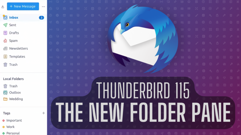
In our last blog post, we announced that we’re rebuilding the Thunderbird UI from scratch, with the first results coming to Thunderbird 115 “Supernova” this July. We also explained why it’s necessary to begin removing some technical and interface debt, and to modernize things in order to sustain the project for decades to come. That post may have caused you to worry that Thunderbird 115’s interface would be radically different and ship with less customization options. Perhaps fearful you’d have to relearn how to use the application.
Nothing could be further from the truth! In this post — and in future Supernova previews — we want to put all those worries to rest by showing you how Thunderbird 115 will be intuitive and welcoming to new users, while remaining familiar and comfortable for veteran users.
Today we’re going to take a look at the new Thunderbird folder pane. That’s the section on the left of the application that displays all of your mail accounts, feed accounts, chat accounts, and local folders.
Folder Pane: Thunderbird 102 vs Thunderbird 115
Here is what the folder pane looks right right now, in Thunderbird 102:

Now, let’s see the new folder pane that’s coming in Thunderbird 115. Don’t worry, we’ll explain the new design and the new buttons further down.

See how roomy and breathable that is? See all the white space that helps prevent cognitive overload? This will feel familiar to users who’ve only used webmail in the past.
Wait, wait! Before you get angry and close your browser tab, let’s take an additional look at the Thunderbird 115 folder pane, right next to the existing Thunderbird 102 folder pane:

Hmm, that looks identical to the current folder pane! What’s going on here? The above iteration of the Thunderbird 115 folder pane simply has Unified Folder mode turned off, and the density set to default instead of relaxed.
It’s exactly what you’re already used to!
Different People, Different Needs
We understand that many of you love the traditional, compact Thunderbird UI that presents much more information at a glance. We also know that many of our users dislike all that information being so cramped and squished together.
So, who’s right? Everyone is right! One of the benefits of rebuilding the Thunderbird interface from scratch is that we can better tailor the application to satisfy different people with different needs.
New Feature: The Folder Pane Header
Some users rely on the toolbar, shown just below, for their action buttons. That area near the top of Thunderbird has always been the default location for the main actions in your current tab.

But others prefer to completely remove all buttons from the toolbar, and rely exclusively on the menu bar to access options and features. A different set of users might completely hide both the menu bar and toolbar and interact exclusively with shortcuts.
These situations are just a few examples of how different users like to change the interface to feel more productive. That’s why we’re planning to offer more easily discoverable contextual options for specific areas.
That’s where the new Folder Pane Header enters the picture:

Using a primary button to highlight the most important action in the current context (like writing a message) is a common UX paradigm that helps new users focus on simple, common actions.
Adding that button in the new folder pane makes it easily accessible for users that rely on assistive technologies, or who navigate exclusively with a keyboard.
In the same area, we added a button to fetch messages from the server. Just in case users want to force the syncing process.
On the right, an accessible “meatball” menu button will allow users to:
- Change the layout of the pane
- Switch folder modes
- Show or hide local folders and tags
- …and many more options that normally would be hidden inside some submenu of the menu bar.
What if you don’t care about these new buttons and don’t want them? Are they just a waste of space in your workflow? You can simply hide the entire area with one click, and that preference will be remembered forever in your profile.
New Feature: Tags and Local Folder Options

Younger users have become used to using simpler interfaces. They’ve never used a “Local Folder” and probably don’t even know what that is. So, we’re offering a simple option to turn the Local Folders display on or off.
You might be familiar with Tags, which are basically labels that filter your email. Tags behave a lot like virtual folders. If you select a Tag, you end up with a subset of messages that have that tag, which simply looks at a folder with the same tag name.
We understand that some users might prefer having the Tags button in the toolbar, or not using tags at all. Meanwhile, others might rely heavily on tags. That’s why we’re adding the option to show them in the new folder pane.
As you’d expect, you’ll be able to re-order all these sections to suit your own preferences and workflows. And if nothing in this entire post appeals to you, rest assured that all of it is completely optional in Thunderbird 115!
For users who don’t consider the current Thunderbird interface comfortable, we’re confident these new features will make you feel right at home — with the added benefits Thunderbird brings compared to traditional webmail: privacy, customization, no ads, and absolutely no selling of your data.
Thunderbird 115 “Supernova” launches this July. A beta will be available for you to try by mid-April.
The post Thunderbird 115 Supernova Preview: The New Folder Pane appeared first on The Thunderbird Blog.